
Redesigning Himiway’s post-purchase onboarding experience to help riders assemble their e-bikes faster, make fewer mistakes, and ride with confidence.
Role
UX Manager — Growth & Operations
Timeline
3 months
Scope
Customer Research · Experience Design · Information Architecture · Web UX · Usability Testing
Company
Himiway
Impact
By combining customer research, clearer instructions, and a more structured support system, we helped more riders assemble their e-bikes successfully, reduced support demand, and significantly improved the overall customer experience.
27%
→
95%
Completed assembly within 2 hours
Assembly error rate
55%
→
10%
Fewer assembly errors
Support inquiries
35%
→
10%
Fewer assembly-related support inquiries
Customer satisfaction
60%
→
95%
Overall onboarding satisfaction
The Problem
Himiway’s e-bikes arrived partially assembled, making setup a critical part of the first-use experience. While monitoring customer communities, I noticed recurring complaints about assembly manuals. Rather than treating them as isolated feedback, I identified a pattern and added manual satisfaction to our next customer survey to quantify the issue.

We already knew the manual wasn’t working well, but the numbers still caught us off guard.

Reframing the Problem
Rather than jumping straight into a manual redesign, I validated the problem through an onboarding satisfaction survey, a manual audit, social media feedback, and prior customer research. The research showed that the manual had clear usability issues, but it was only one part of the problem.
Among customers who had purchased within the previous three months, only 27% reported completing assembly within three hours. Many female respondents also reported difficulty unboxing the bike without assistance.
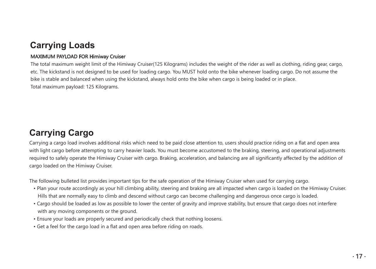
Conflicting product informationKey specs, such as maximum load, were inconsistent across pages.
Critical guidance was hard to find. Manuals, maintenance information, and troubleshooting content were buried across the website.
Official video guidance was not the most useful. Riders preferred community-created videos because they were clearer and more practical.
Users had different learning preferences. Print remained far more important than expected, while others relied heavily on video.
First-time e-bike riders lacked confidence and education. Many needed more guidance before feeling ready and safe to ride.
Users needed support beyond assembly. They also wanted troubleshooting, maintenance, and ongoing ownership guidance.
Strategy & Ownership
Clarity - Make each next action easy to understand without requiring technical expertise.
Safety - Surface critical checks before the first ride and reduce preventable assembly mistakes.
Findability - Make the right guidance easy to discover across Himiway’s website, manuals, videos, and support content.
Consistency - Create reusable instructional patterns across products and channels so customers encountered a more coherent experience.
I led the end-to-end redesign of Himiway’s customer onboarding experience, from research and experience strategy through design, production, usability testing, and post-launch evaluation.

Customer Support · Content · Photography & Video · Production
System Design
Rather than asking every format to explain everything, I assigned each channel a specific role based on what customers needed at that moment.
01 — Make the next action obvious
I redesigned 7 manuals to turn dense, technical instructions into a clearer assembly path—simplifying language, strengthening visual sequencing, and making warnings and next steps easier to spot. The goal was to reduce interpretation and make progress through assembly more obvious.
02 — Match the medium to the task
We complemented the manual with assembly videos for users who preferred visual guidance.
Repair and maintenance content required more flexibility and frequent updates, so we developed 100+ short troubleshooting videos instead of embedding them in the manual. These were maintained as an internal support library and shared by customer service only when relevant to a customer’s specific issue.
03 — Build safety into the journey
Finishing assembly did not necessarily mean the bike was ready to ride.
To support safe riding beyond day one, I designed a standalone pre-ride safety guide in a poster format, deliberately separated from the manual.
That decision reduced the chance of the checklist being overlooked or lost, kept it visible in the customer’s space, and made the final safety check a repeatable routine rather than a one-time step.
04 — Design for recovery and findability
When customers encountered an exception or made a mistake, they often struggled to locate the right troubleshooting information.
I redesigned the Help Center structure around recurring customer questions and failure points, making relevant guidance easier to discover and navigate online.
This gave customers a clearer recovery path before they needed to contact support.

VALIDATION
completed assembly within 2 hours
REFLECTION
Look beyond the presenting problem.
Design for the system that shapes it.
What worked — Reframing the problem
I moved beyond the manual itself and reframed the challenge as a broader onboarding and customer education problem.
What I’d push further — Design for the moment of use
I still treated the booklet format as a given. In hindsight, I would explore more scannable, task-based guidance designed around how people actually assemble the bike.
What I’d validate next — Test in the real environment
Our usability test measured task performance, and post-launch surveys captured real customer feedback. If conditions allowed, I would also observe customers assembling the bike in their own homes to uncover contextual friction that controlled testing may miss.
What I learned — Design within real-world constraints
This project taught me that UX research is not only about users. Internal research mattered just as much: understanding the constraints across manufacturing, packaging, logistics, and support helped me see why the experience existed as it did. Good UX is not designing the ideal experience in isolation. It is finding the best achievable experience within product, operational, and business constraints.